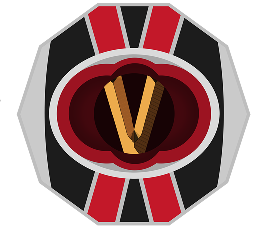

Franklin is the fourth highest corporation. They were the original trendsetters but they have lost touch over the last century.
(I did a previous Logo Exploration that you can find here. However it was back when I was persistent in the idea of including the whole name in the logo, which didn’t really work in hindsight).

The Franklin Logo is a bit more complicated, but I’ve still tried to keep the overall design quite simple.
The subject this time is quite obvious. Franklin has always been at the forefront of technological advances.The shape is also reminiscence of a badge because of Franklin’s tendency to ‘police’ the areas without proper control measures.
I still like this one, but it’s my least favourite out of the five. I could never get it looking ‘perfect’.
_______________________________________________________________
Writing wise, I’ve done a chapter review with a friend. I’ve also been helping him with his story, being sort of a personal trainer for writing. It sounds silly but I feel it could be an avenue of business I could get into, as I’m good at it.
_______________________________________________________________
The Franklin Logo is also part of the cover design. Tomorrows Logo will be Ratter’s.
Keep safe,